Tether Payments
Product
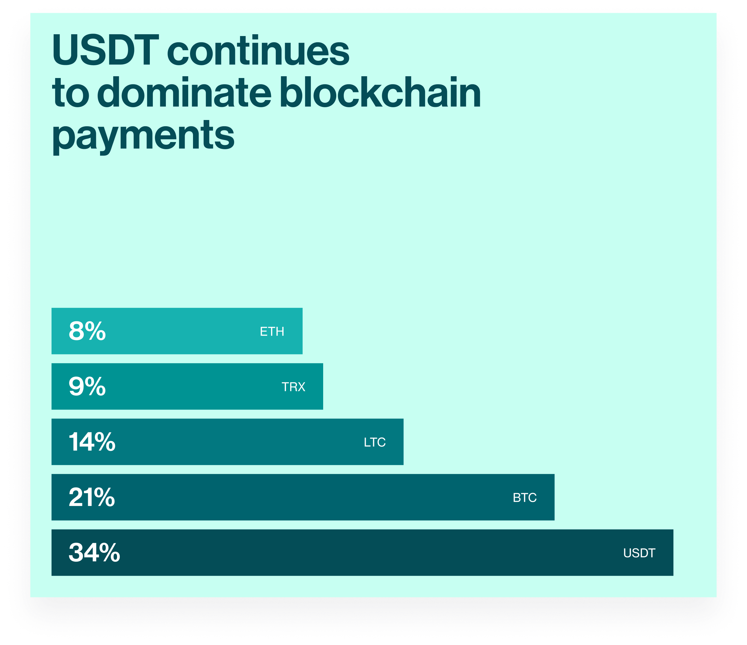
With 500M+ users, Tether bridges the gap between investment and utility. It provides a high-trust ecosystem for storing and spending funds across a global network of online and in-person merchants.
My Role
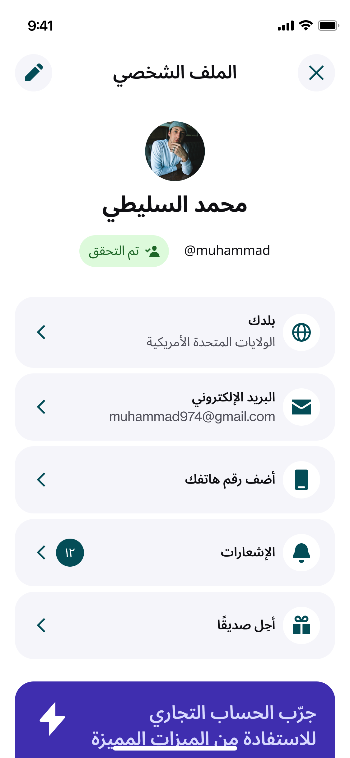
Light and dark themed iOS native app: UI, UX, including full RTL architecture, Eastern Arabic numeral handling, and a shipped financial app designed for Arabic users.
Timeline
2025
Team
Brand, Design & Research, Product
Core experience
A minimalist financial tool for two audiences at once , users already holding crypto, and the billions still outside the banking system.
Fast onboarding, full RTL, and a UI that earns trust without requiring it upfront, all aimed for scale.
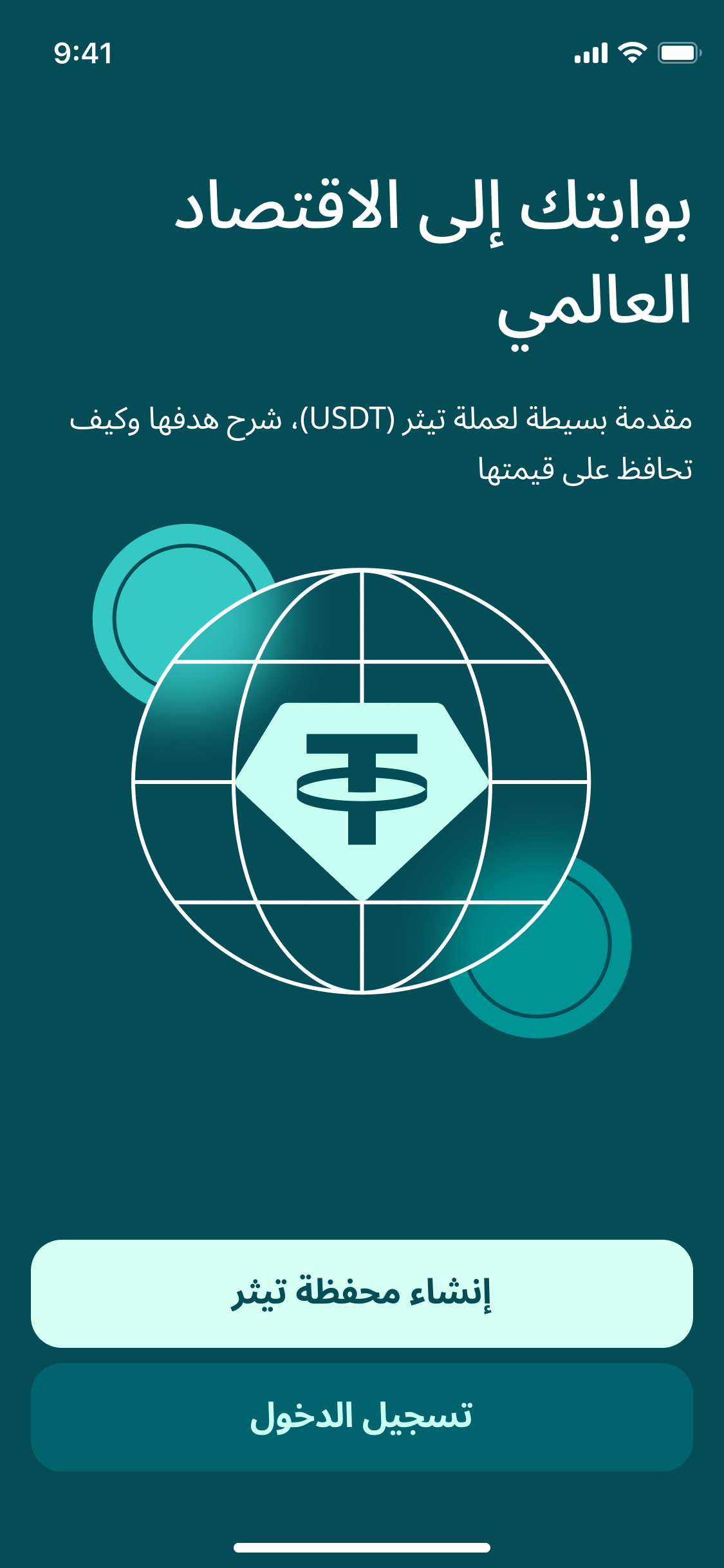
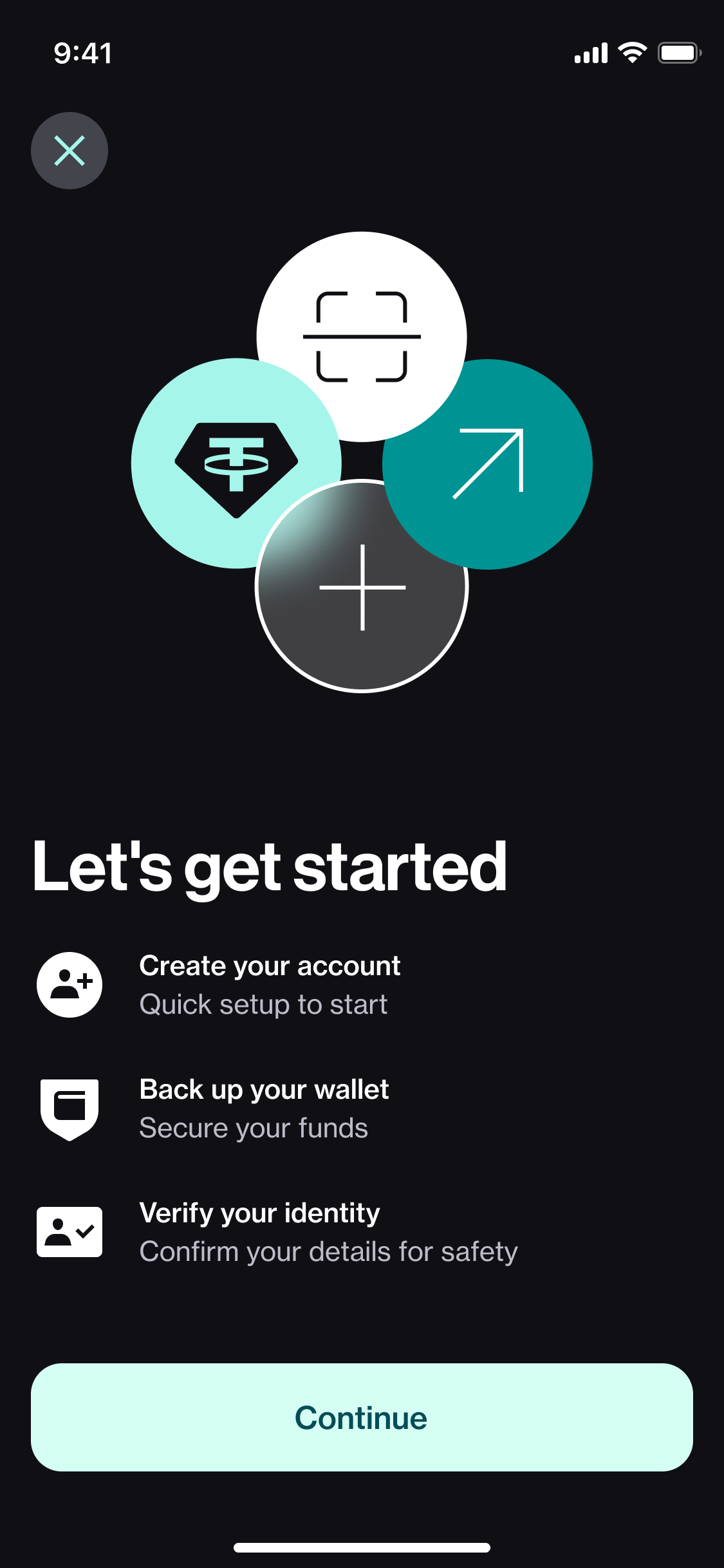
Onboarding & KYC
This solution aligns with UX best practices, ensuring that the integration of digital wallets feels like a natural step rather than a technical hurdle.
The Dashboard & Transactional Core
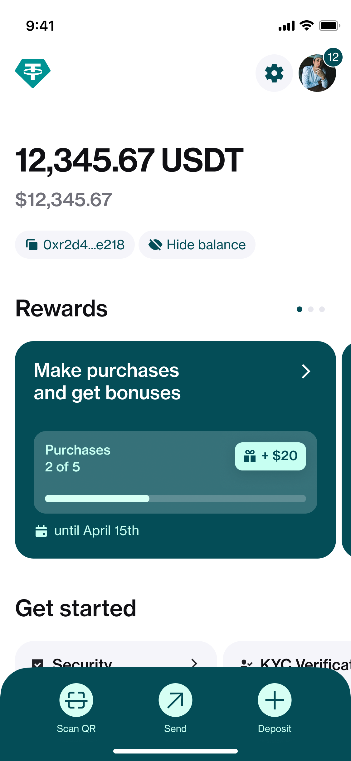
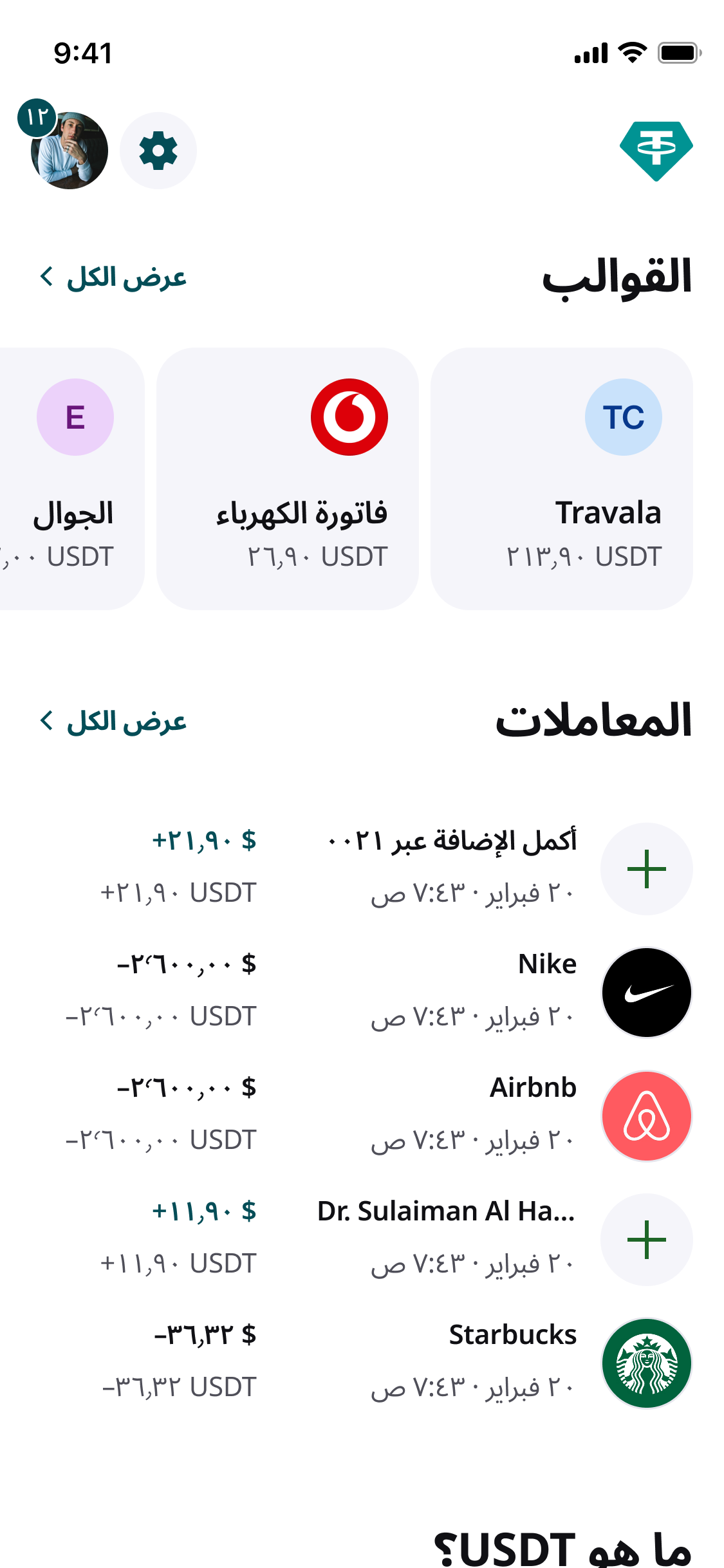
Wallet Integration: Visualized balances and token holdings with “Tether-inspired” clarity.
Transaction Details: Created clean, data-rich detail pages that provided transparency for every dollar-backed payment.
Right-to-Left (RTL ) Architecture
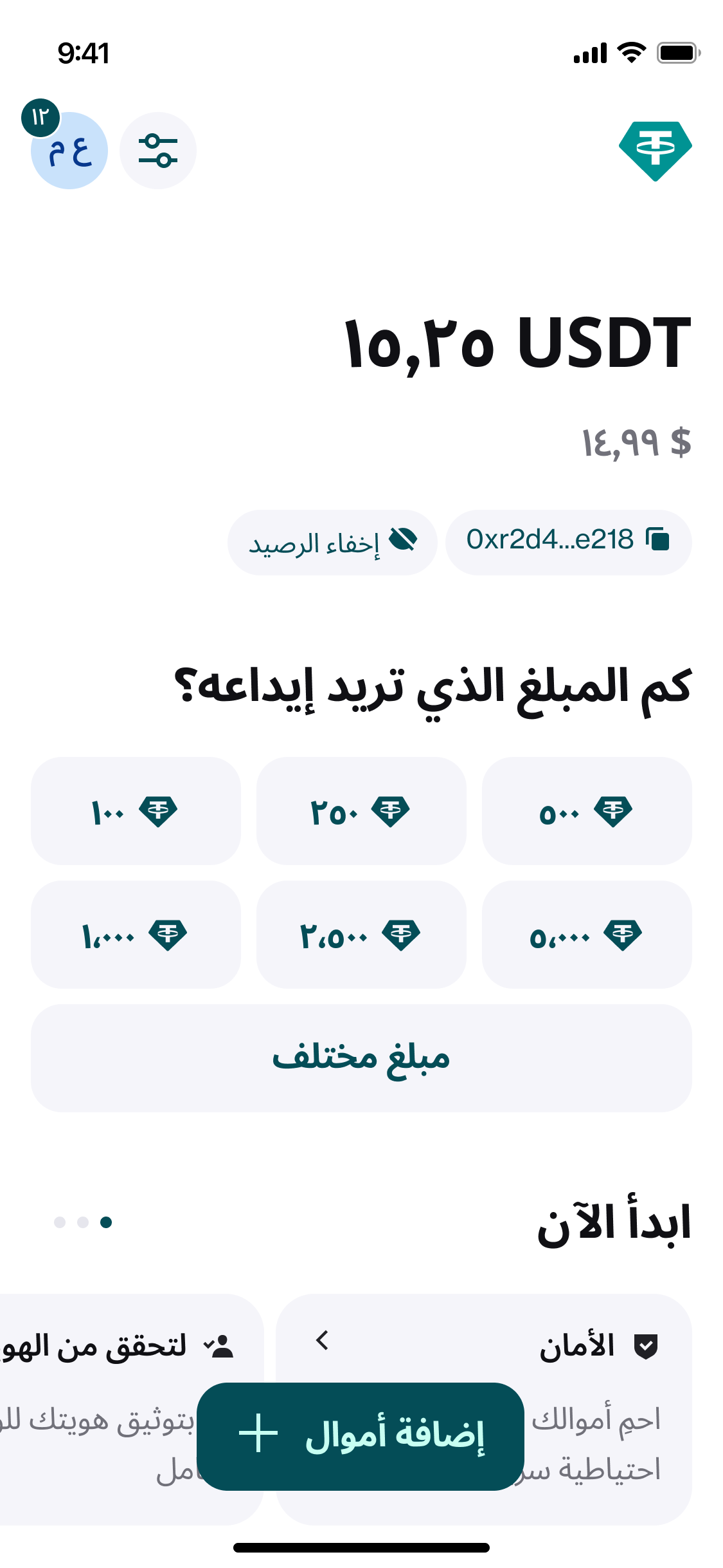
Beyond mere mirroring, the solution reengineered the information architecture to honor the visual hierarchy that Arabic readers naturally prefer
Two types of numerals were covered to ensure clarity and accuracy in presenting currency and amounts, which are critical for building user trust and enhancing usability
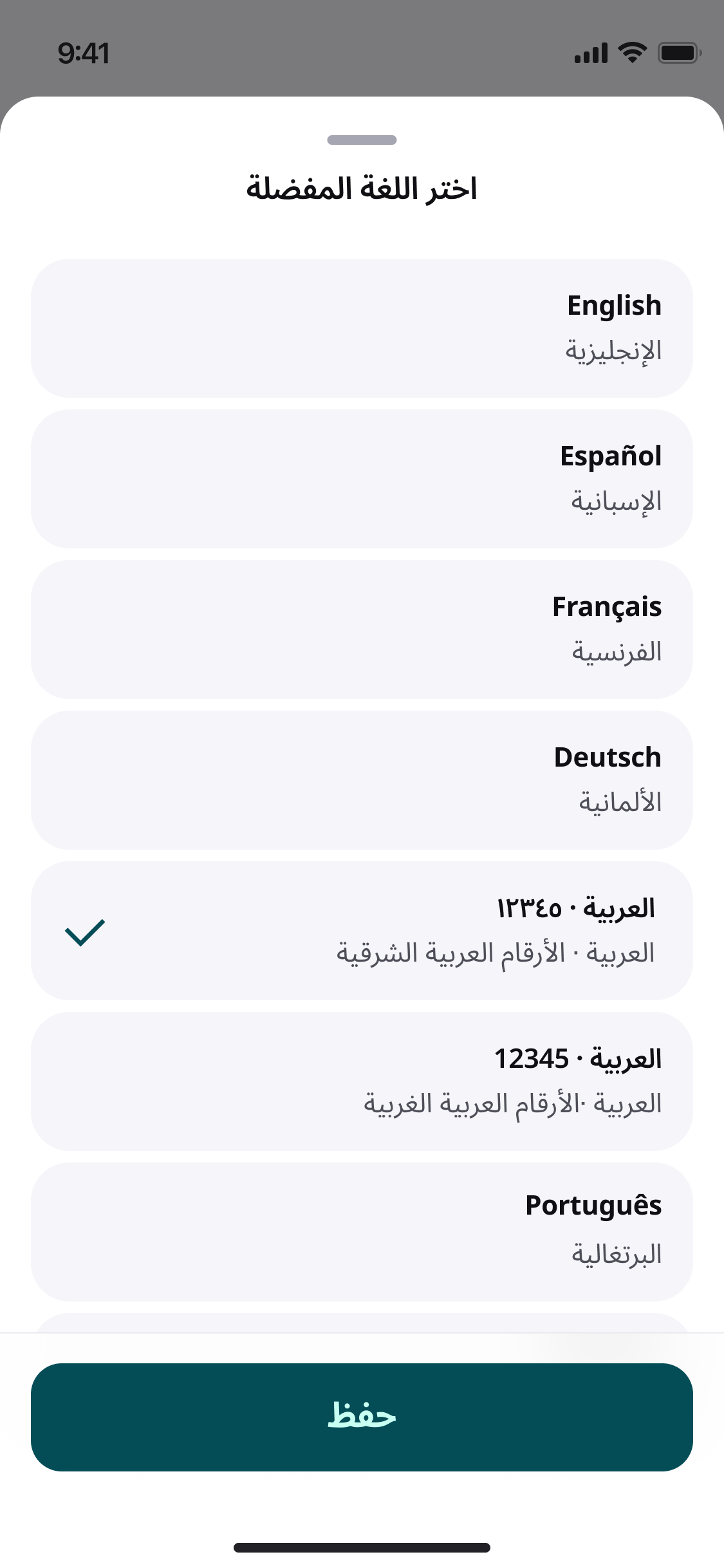
Typography
1. Used Noto Sans for Arabic
2. Adjusted line height
3. Used negative letter spacing
4. Manually matched font weight
Inputs
The biggest challenge arises when Latin digits are involved, such as in the case of verification codes.
Solution
When a field contains Latin digits and fits on a single line, the digits will be displayed left-to-right (LTR) within the RTL layout.
The alignment is adjusted based on the layout context , either filling the available width or centered.
Variables
The scalable variable color system allowed for the implementation of a dark theme.
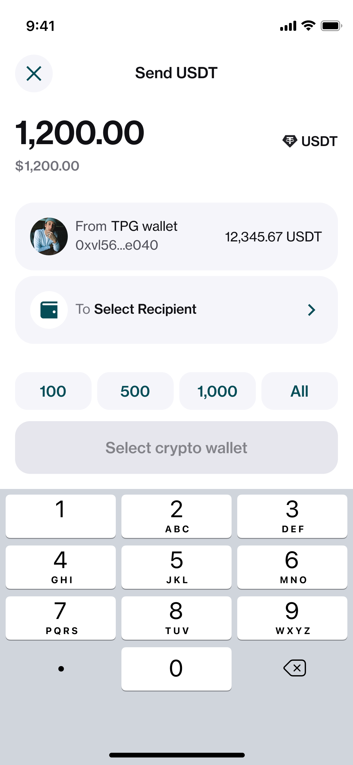
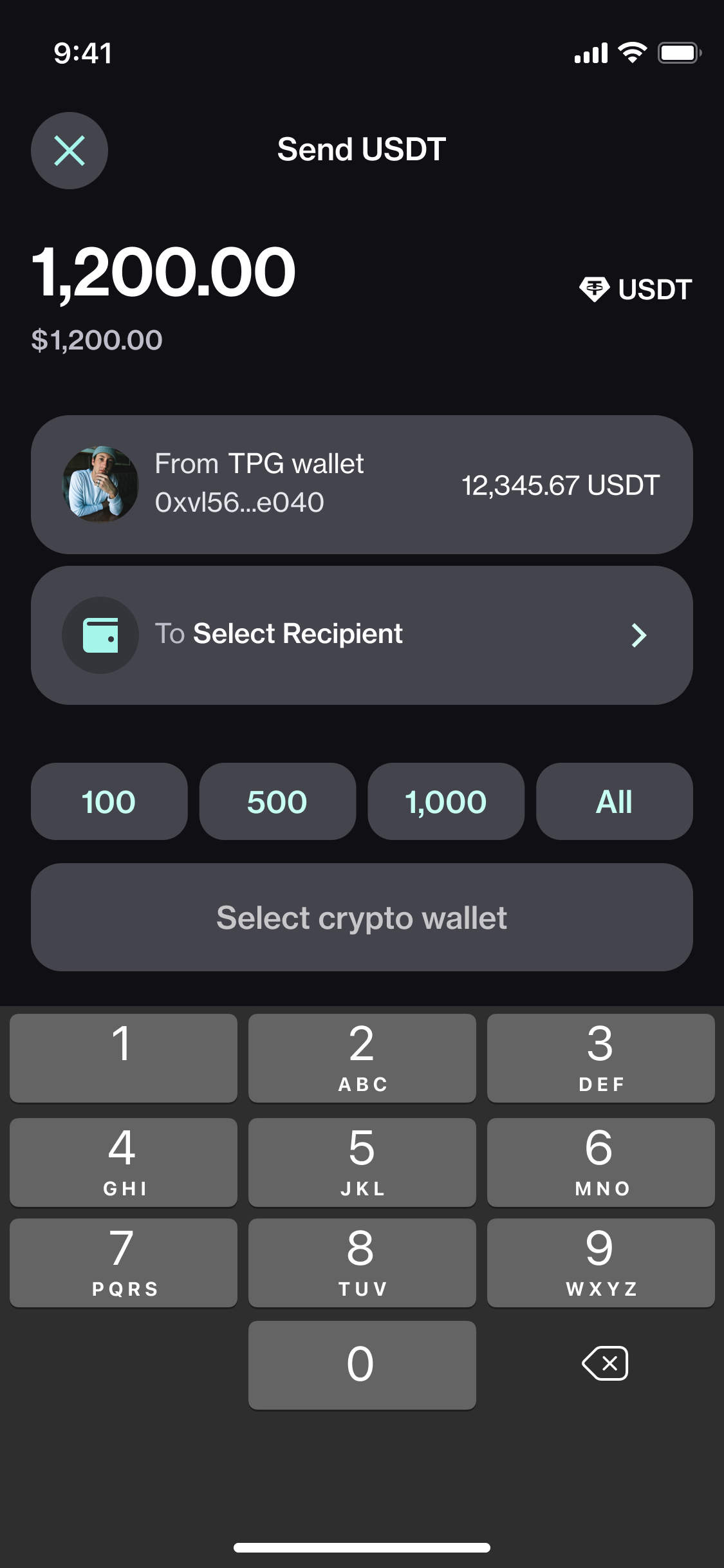
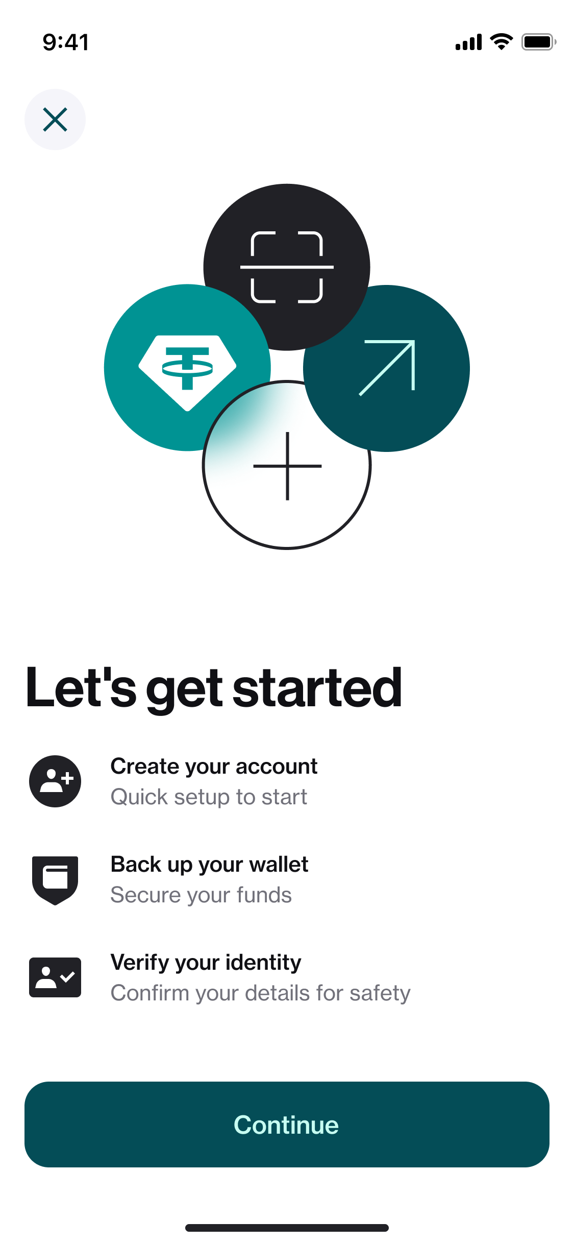
The library includes illustrations and icons in both light and dark versions.
1 in 10
Arabic language users kept the app because it finally felt built for them.
500M+
users already rely on the experience we've built, which is designed to support their needs effectively.
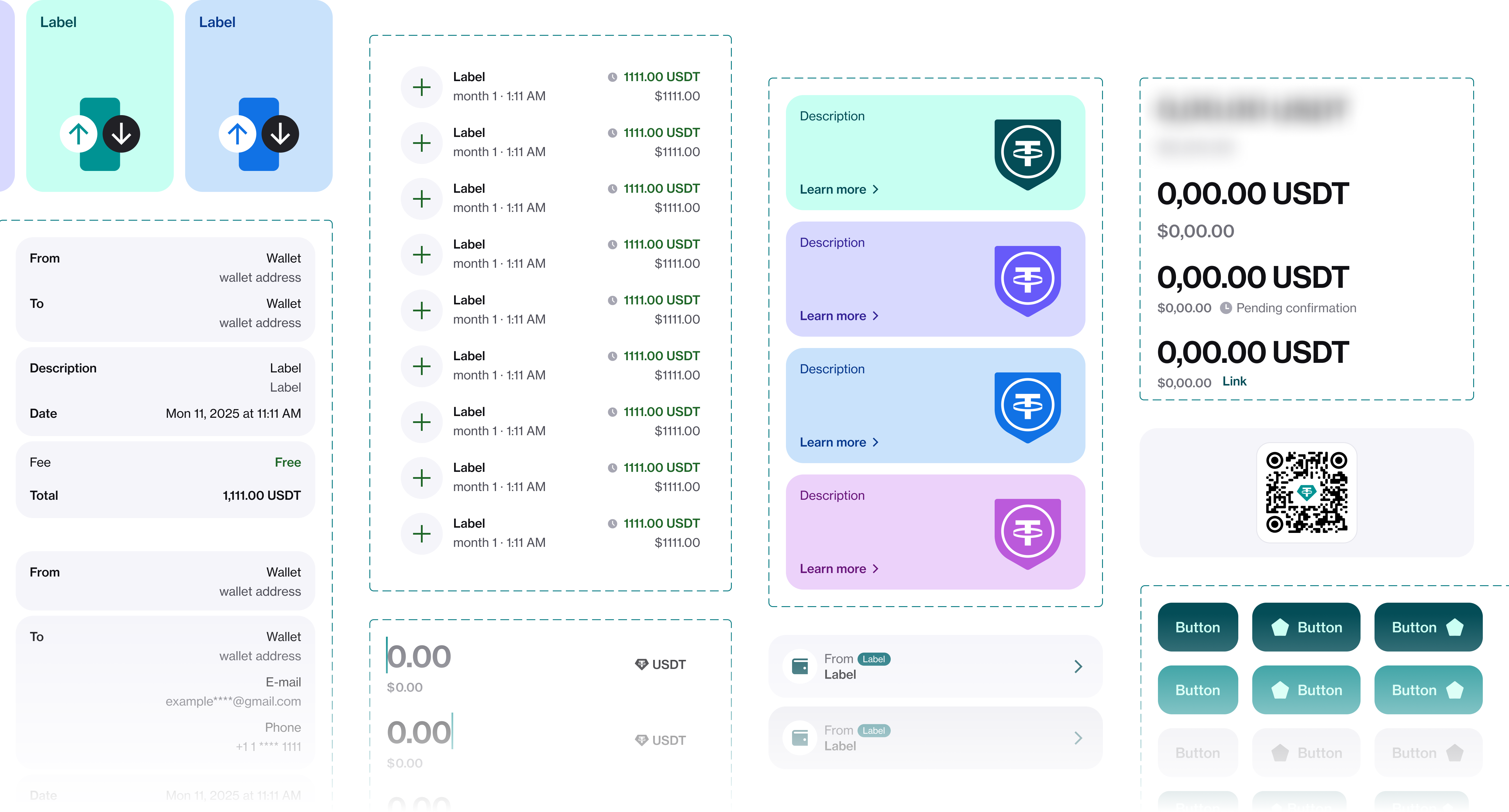
UI Library
Every component documented for both LTR and RTL use, light and dark , a single source of truth for a dual-language, dual-theme product.