Gold.com

Product
Gold.com is a new precious metals store and investment platform designed for a Fortune 500 company.
The goal was to attract a new generation of buyers through a guided, emotionally engaging, and luxury experience, while still appealing to the existing rational audience of JM Bullion.
My Role
Owned a complex, trust-first financial product from discovery to shipped UI, across a multi-surface web experience (desktop, tablet, mobile), for a Fortune 500-backed company in a high-stakes category.
Platforms
Mobile web, Desktop and Tablet breakpoints
Timeline
2024 – 2025
Team
Brand, Design & Research, Product
Potential for growth
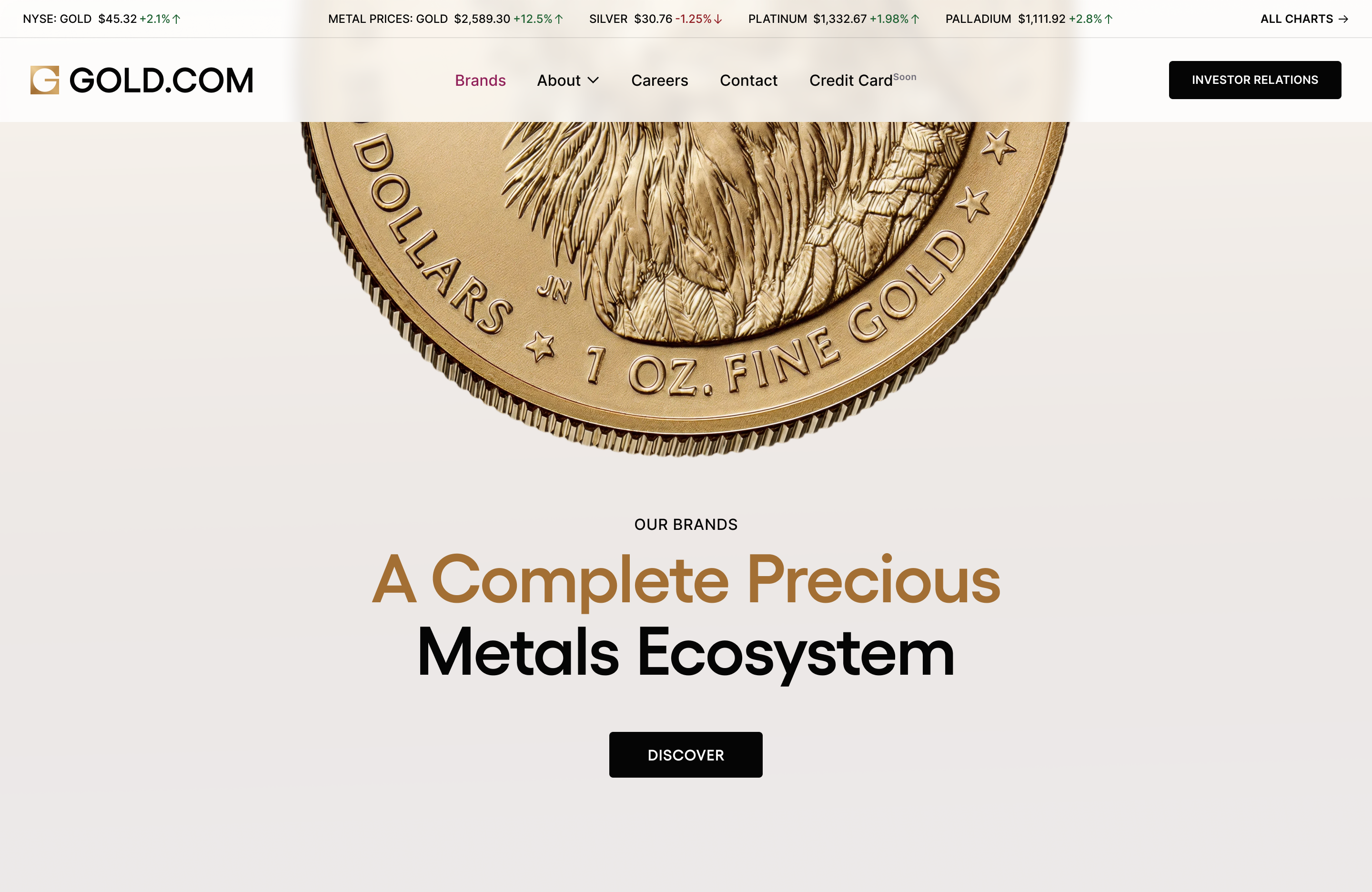
Every competitor in precious metals provides the same outdated, transactional experience. Gold.com was designed to be fundamentally different.
The vision was an emotionally engaging experience that could win over first-time buyers while giving expert buyers the speed and depth they needed.
Biggest challenge
Designing end-to-end experience for four different buyers: investors, preppers, collectors, and newcomers.
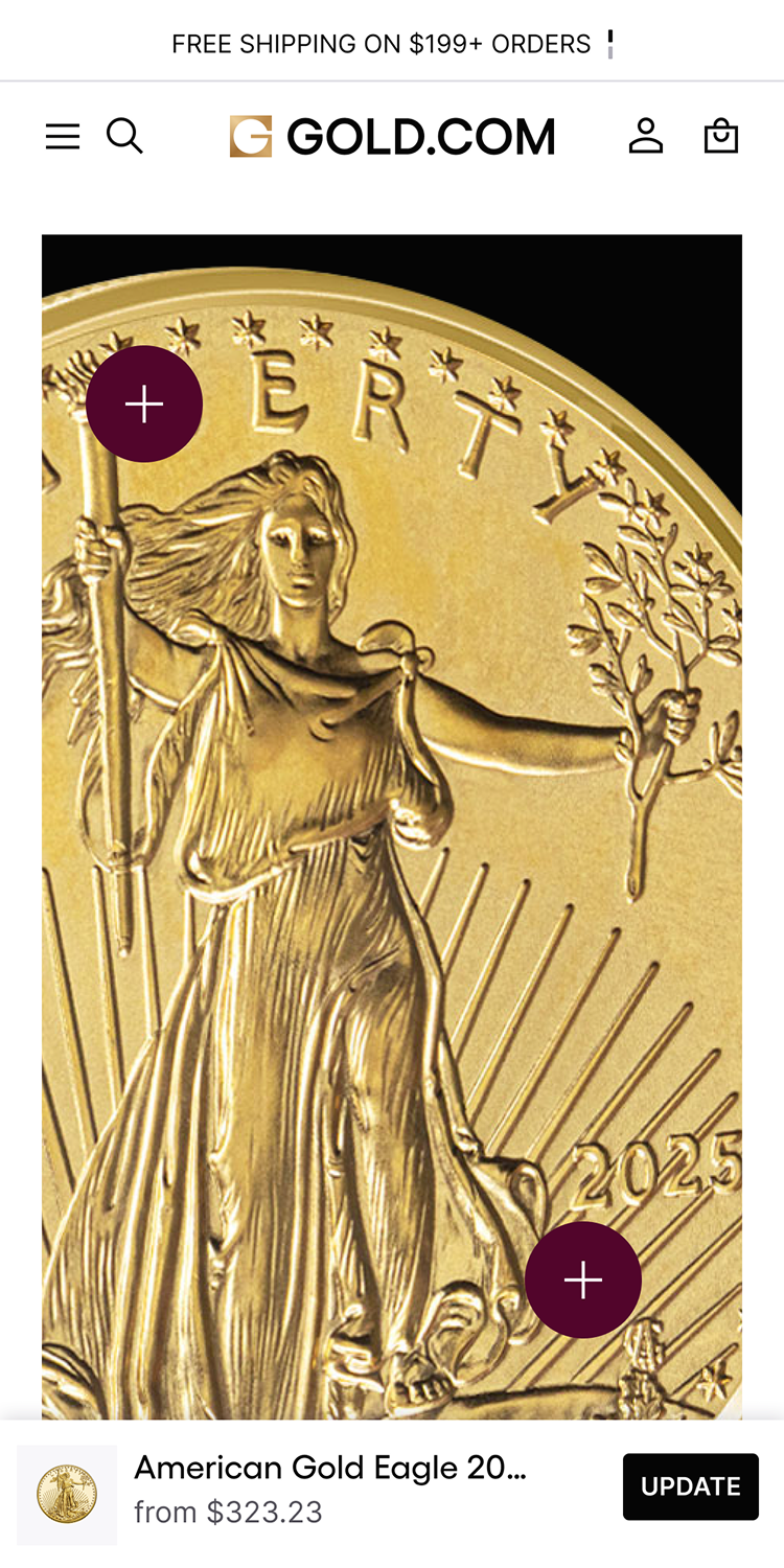
Solution
Personal, guided service for the newcomer, without added friction for the returning buyer.
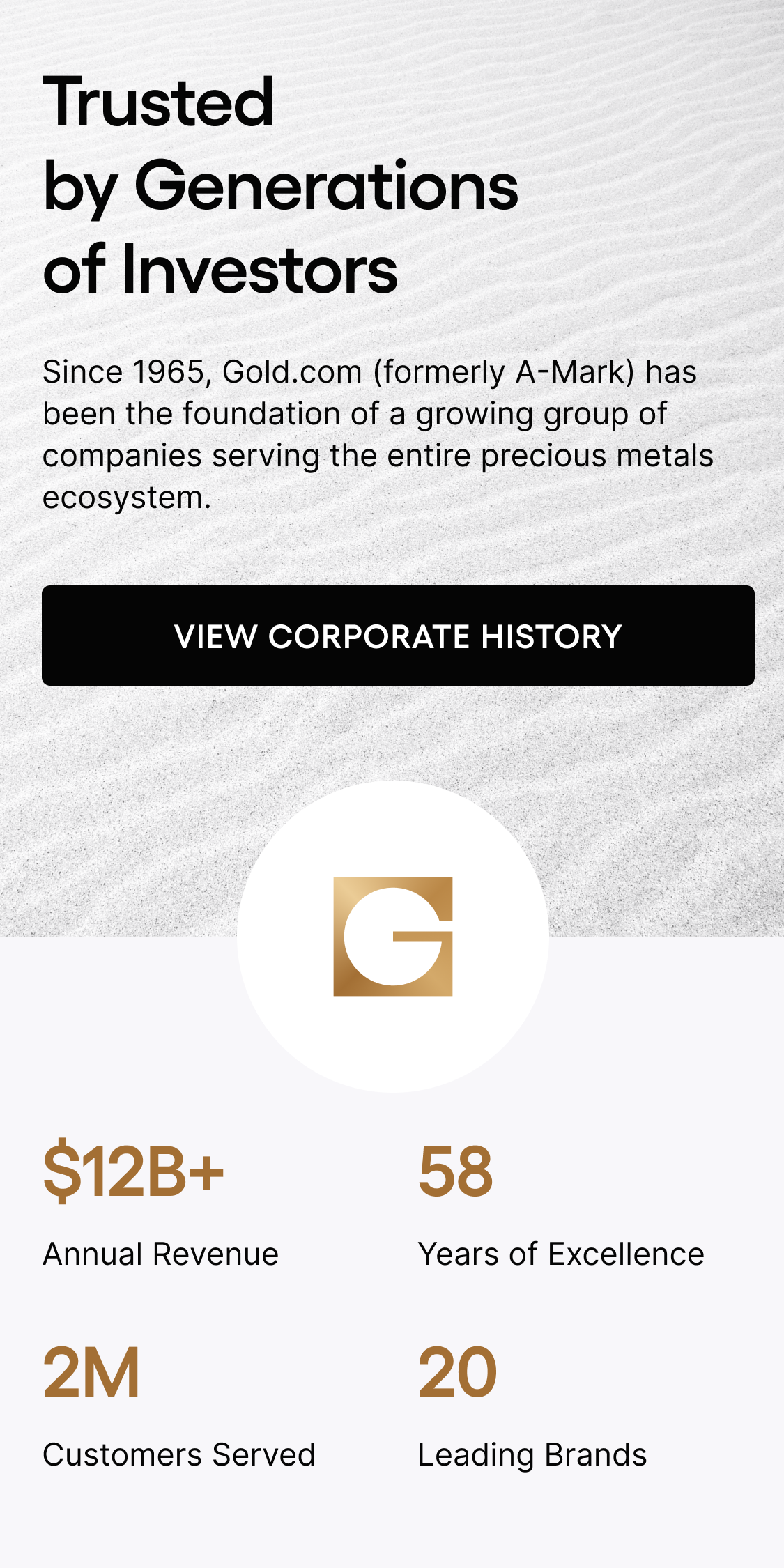
Potential
Design experience for the new buyers who need more support: charts, education info , cater for their needs at every step.
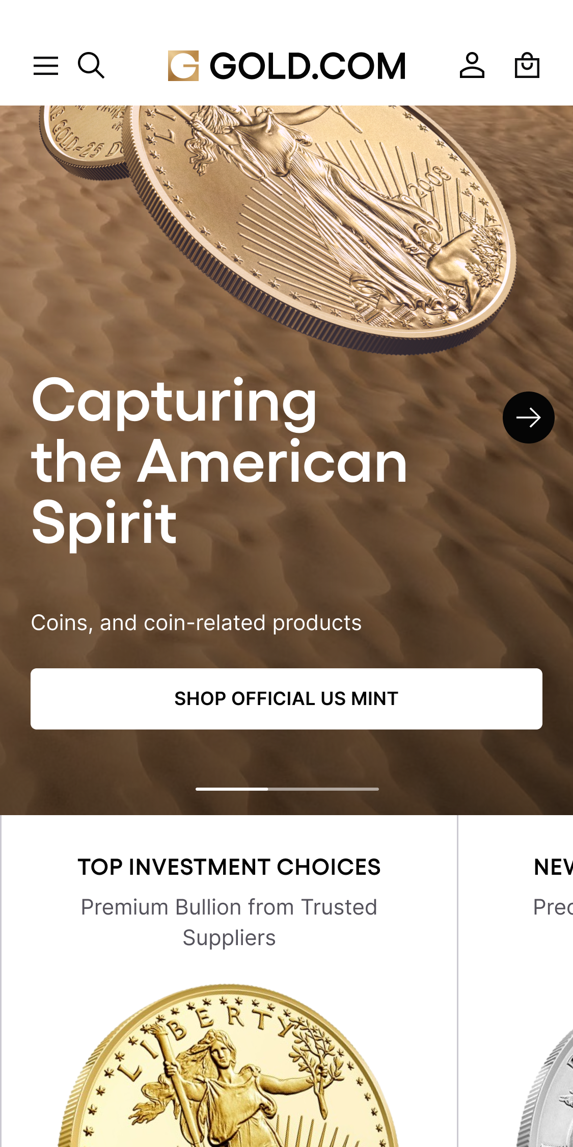
Navigation
Homepage redesigned as a decision point , routing each user to their own path.
Solution
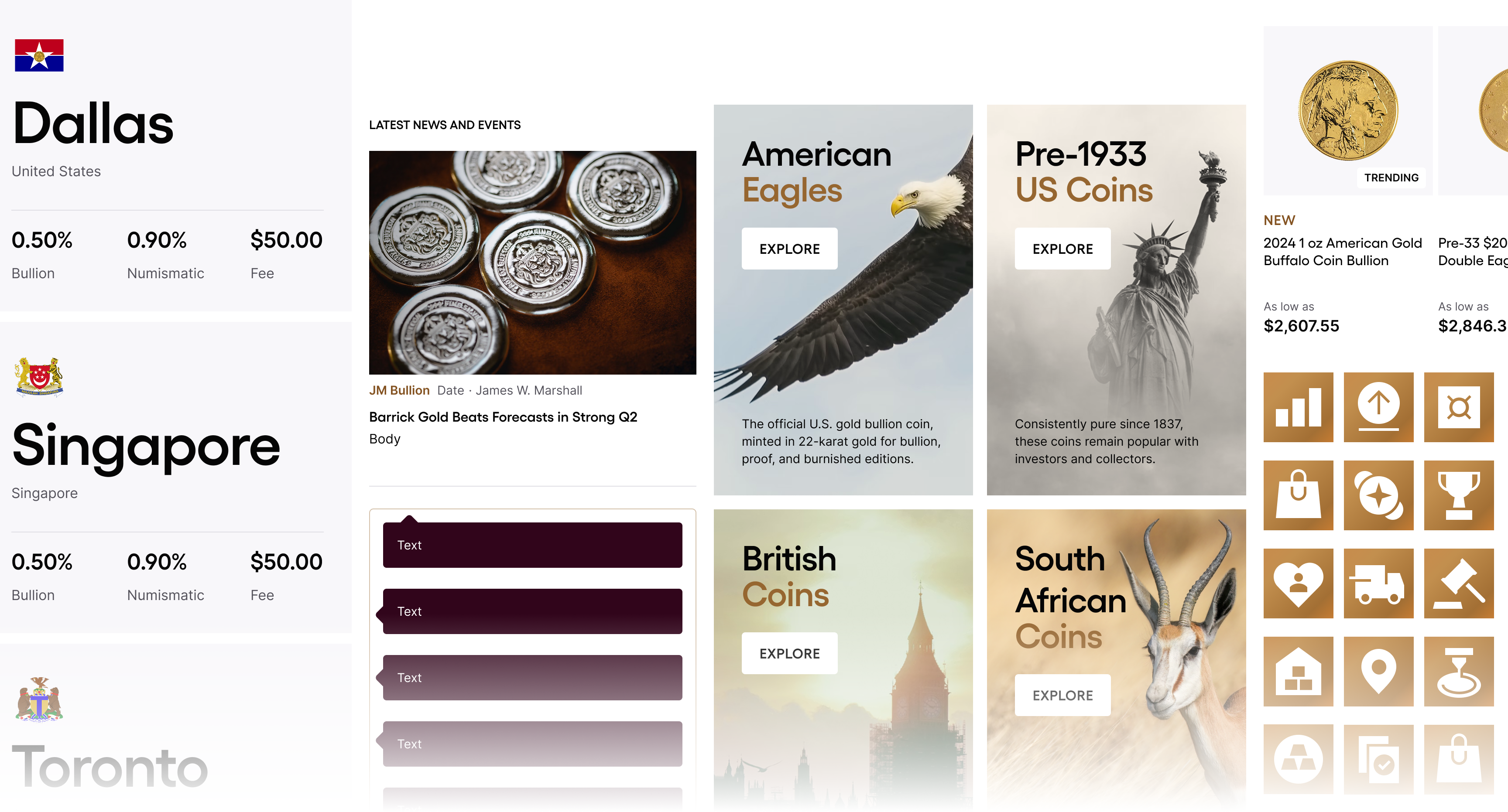
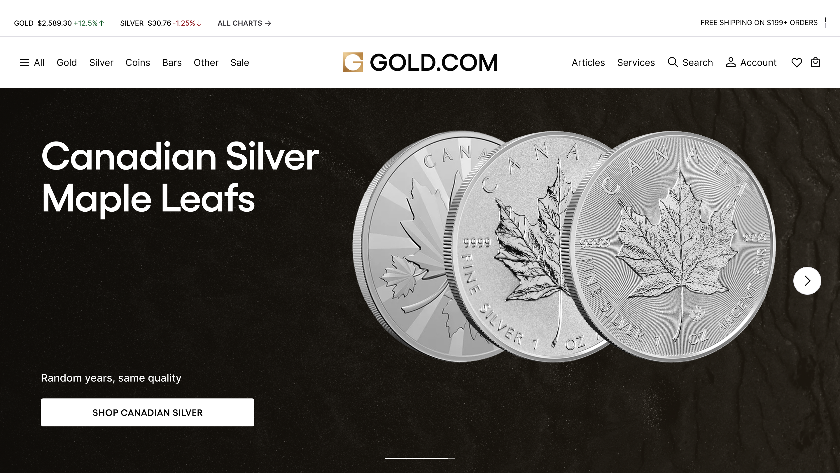
Navigation reflects 2 mental models: a full-depth catalog for experts, illustrated quick-actions for newcomers, separated at the architecture level so neither group hits friction meant for the other.
Checkout optimization
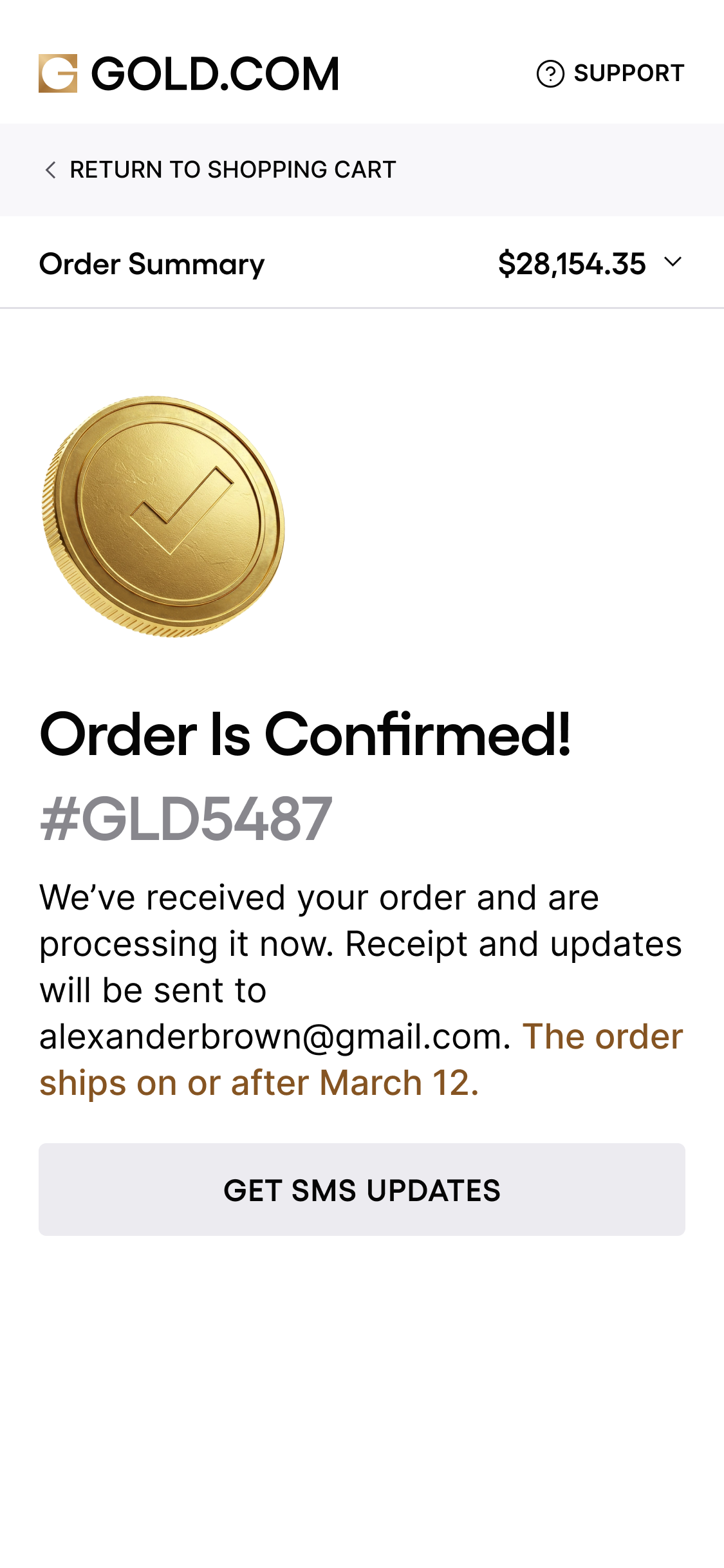
In precious metals, a confused buyer doesn't abandon a cart. They leave permanently and don't come back.
Potential
Every edge case designed, not assumed.
Solution
One decision per screen. Price lock , a visible, timed mechanism , freezes the spot price mid-flow.
Solution
Storage and vaulting surfaced early , a user anxiety turned into a front-facing product feature and a higher-LTV retention lever.
User interviews insight
“Is this a real investment?” and “What do I do with it?” , these unanswered questions deterred first-time buyers from making larger purchases.
Solution
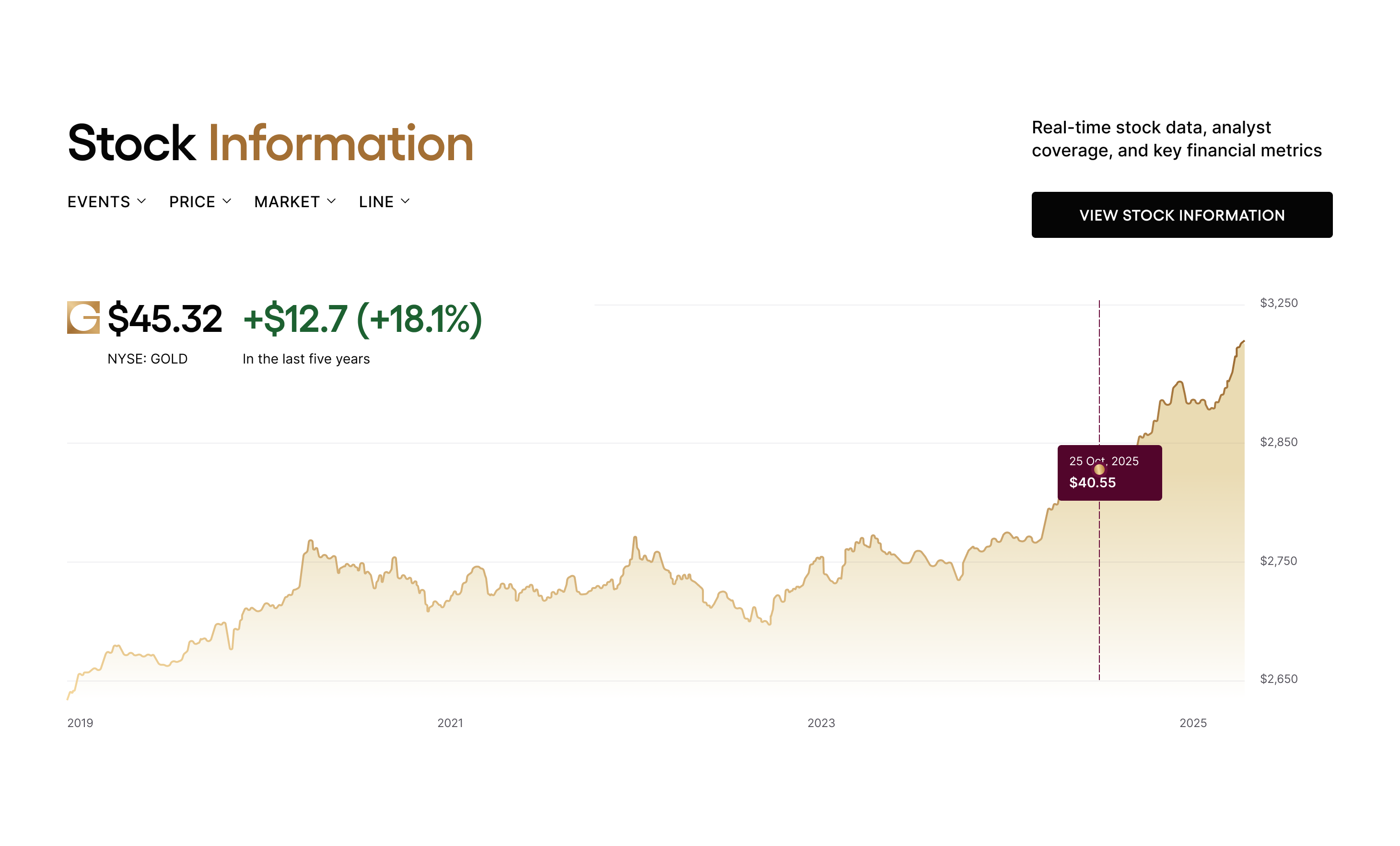
Price graphs and calculators built into the experience as trust infrastructure.
Solution
Storage and vaulting surfaced early , a user anxiety turned into a front-facing product feature and a higher-LTV retention lever.
The acquisition channel nobody built
Competitors either ignored Precious Metals IRAs or explained them so poorly that most buyers weren't aware of this high-value, high-intent product.
For Gold.com, organic search for retirement diversification brings buyers with intent and no destination. A clear, front-facing IRA experience captures that traffic before a competitor does.
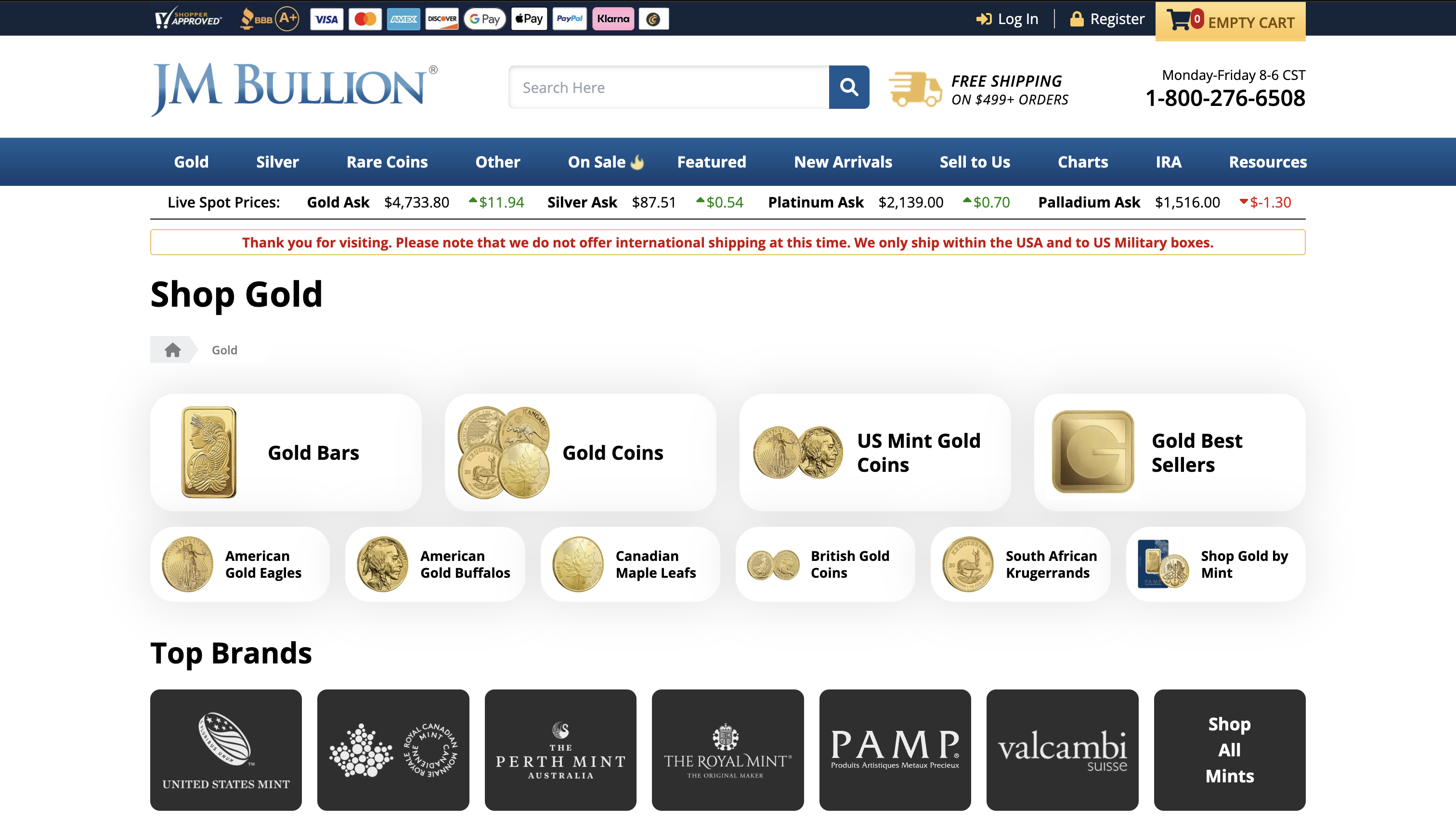
Before
outdated marketplace nearly identical to all competitors
+31%
of new registrations from buyers under 35
3
step guided entry: open → fund → invest.
+22%
second orders with bigger checks
UI Library
The scalable UI-kit made it possible to scale the brand to the marketplace and the corporate website.