
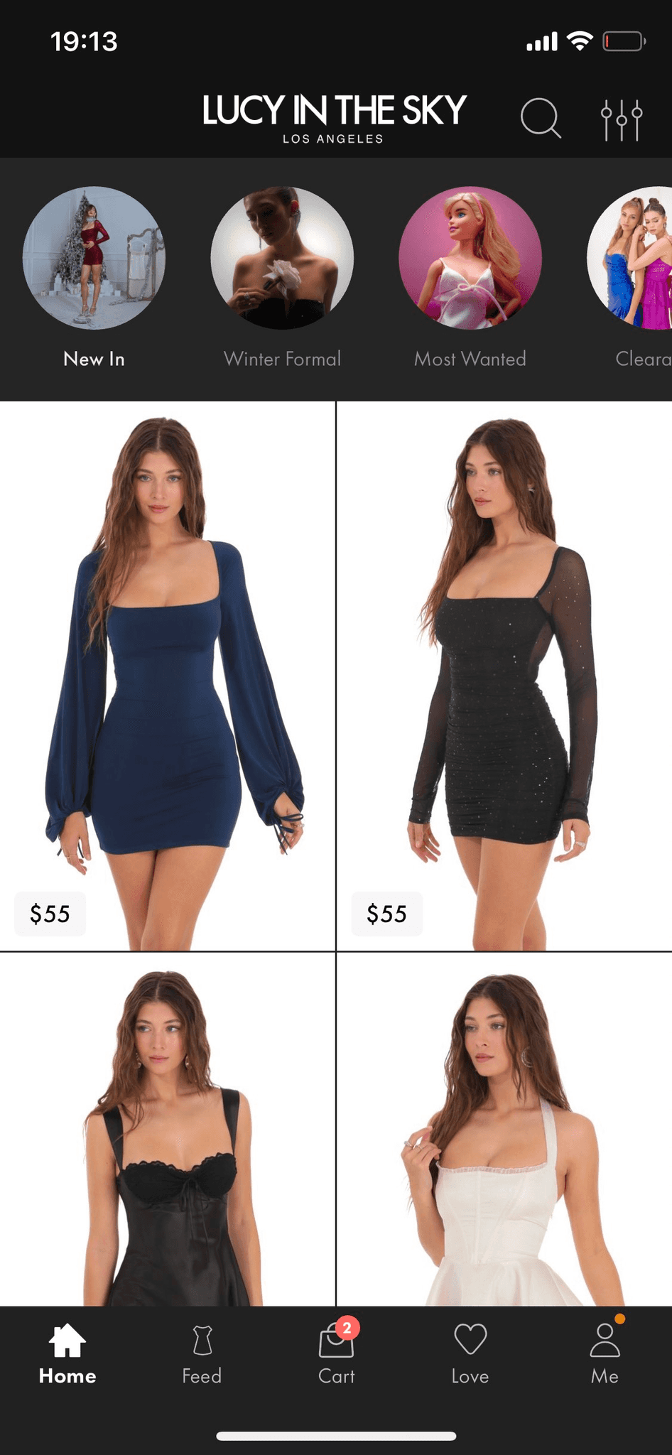
Selected project
Adapting online shopping for Gen Z
Confidential information is excluded per my NDA. This case study reflects my views, not Lucy in the Sky's official viewpoints

DELIVERABLES
Product design
Design strategy
Research
PLATFORMS
iOS
Android
USERS
Gen Z, living primarily in US and Canada
B2C


CASE 1
Successfully redesigning the main and navigation
DELIVERABLES
UX/UI design
UX audit
Secondary research
UX writing
Components
Stakeholder interviews
Team workshops
TEAM
Product designer (myself)
C - level executives
Product manager
3 developers
RESULTS
Total sales increased, and user engagement has improved
HYPOTHESIS
Delving into problems
At the moment I joined the team, Lucy in the Sky had a video-based shopping app, that had several issues:
Low conversion to the product details page
The original home screen looked exactly like the TikTok feed. Essentially, people tend to view the item closely before purchasing. However, only a few users were reaching the product details screen from the home app section.
Low conversion to the cart and wishlist
Even though each video included a CTA for the cart and wishlist, people were not using it much.
Low user engagement
Even though the TikTok-like feed was built to get users' attention, people were not spending much time discovering what Lucy has to offer, either on the home screen or in the app overall.
FIRST ITERATION
What if the problem is in the TikTok- like format?
To test our hypothesis, we conducted a quick and simple A/B test over one month. This approach saved money and time. In addition, this strategy is good for returning users, since according to Weber's law, users adapt better to small incremental changes.
In the A version, the interface stayed as it was. In the B version, we replaced the actual home screen with the discover screen, which featured tabbed categories and a listing grid. Additionally, we made the app's tab bar more visible. The discover screen was replaced with the listing grid.
A custom period was chosen to ensure the percentage of users for each version of the app was roughly equal for accurate data analysis. The data was segmented by app version and collected across all app sessions. The average number of sessions per user during the off-season was three.
Old TikTok- like Home screen (A)


Fast experiment: featured tabbed categories and a listing grid (B)

A/B test results
The B version wins, meaning the navigation among video is replaced by categories, visible tab bar and listing grid.

+86,02% increase in engagement on product details screen
The B version saw an 86,02% increase in engagement on the product details screen compared to the A version.
+44,38% increase in product details screen views
User conversion to the product details page was tracked among entire app because it has the highest conversion rates for adding items to the cart. The B version saw a 44,38% increase in total views of the product details screen compared to the A version.
+9,68% increase in cart additions
The B version had a 9,68% increase in total cart additions across the entire app compared to the A version.
+9,35% increase in total sales
The B version saw a 9.35% increase in conversion to sale compared to the A version, across the entire app. Overall sales conversion rate was 3,75%.
+2,11% increase in engagement
The B version saw a 2.11% increase in overall engagement compared to the A version.

–3,27% wishlist save crash
The B version saw a 3,27% decrease in adding items to the wishlist compared to the A version. Hypothetically connected to sales growth, people might find what they want and buy right away, might be good to see how the conversion from wishlist changed.
SECOND ITERATION
Design based on research
Why wouldn't we keep the solution as is? First, I delved into the solution to see if we could and found a lot of room for potential growth.
The solution audit revealed opportunities for improvement
The solution still had some critical issues that block the user experience and a few medium issues that could have a negative effect.

Main entry points for purchase scenarios
According to Baymard, there are 4 main navigation methods: categories, the search bar, and direct links to key product categories and sections. The solution only includes search and key categories, but missing out on the catalog and selections.
Discoverability
We knew that quite a few people used search. However, the search feature was hard to reach and spot. The icon in use was quite small, and according to Fitts's law — a predictive model that states the time to acquire a target is a function of the distance to and size of the target — it was also placed in the hardest-to-reach part of the screen on mobile devices.
Wrong visual hierarchy
People perceive information in a way that suggests what is above manages what is below. The filter is placed above the tabs, but in reality, the filtering will affect items within the selected tab.
Too much choice
According to Hick's law, more options lead to harder decisions. Thus, hypothetically, showing users all the items in one category might be overwhelming.
Not making a right impression
According to Baymard, the first screen users see must convey the product's purpose and value proposition. They recommend featuring a diverse range of product types (at least 40% of the catalog) to clearly communicate the site's scope.

Wrong signifiers
The category cards resemble category sections and are expected to open a thematic listing, but in reality, they function as tabs.
Aesthetic-usability effect
People often find well-designed, aesthetically pleasing interfaces easier to use. Therefore, it is crucial that icons are consistent throughout the design. Additionally, improvements should be made to type styles, spacing, and visual elements to enhance overall user experience and clarity.
A/B test
The A version was designed based on secondary research and an audit of the solution from the last iteration. The B version, on the other hand, excluded the FAB button.
We aimed to provide access to the newly redesigned home screen for all users, as we updated all styles and were confident that the improvements did not touch the core meaning of the screen since the last iteration.
Additionally, we measured the bounce rate to ensure that the new version performs well and to determine whether there is a need to revert to the previous version. We also compared some metrics with those from versions earlier than this test to assess improvements and validate the effectiveness of the updates.
Due to release and data collection issues, the metric periods were customized. However, the overall experiment took approximately three weeks.
Well known structure (A)
The filter works for all items, the search is highlighted, the cards lead users to specific parts of the catalog, the main category is emphasized, and the items represent a selection based on user choice.

Adding FAB (B)
The FAB opens all categories and is designed based on secondary research and competitor analysis conducted for the web.


+28,05% increase in engagement on home screen
The A/B options (could't separate in this case) saw a 28,05% increase
+15,49% increase in product details screen views
The A/B options (could't separate in this case) saw an 15,49% increase in product details screen views across the entire app compared to the previous iteration.
+2,89% increase in total sales
The A option (with FAB) saw a 2,89% increase in conversion to sale compared to the B version across the entire app. Overall sales conversion rate was +7,26%.
2,74% are using FAB
While this percentage may seem small, it is significant because it impacts the total sales number.

+0,06% increase in bounce rate
It is not a significant change and might be considered neutral.
The same amount of people is using the category cards
The most popular category is highlighted by the largest banner, followed by the most popular occasion at the time of the test: Prom.
The A version wins, meaning the redesign version will stay, including the FAB.
THIRD ITERATION
Using the power of community
The solution worked, but we still had some user-generated content that we wanted to fully leverage. Additionally, we did not overlook the wishlist save crash and saw an opportunity for further improvement in another iteration.
Social proof
According to GWI, when Generation Z women in America shop for clothes, they look for social validation, which can be expressed through likes, positive comments, and other mechanisms. This also aligns with the psychological principle of Social Proof—users adjust their behavior based on what others are doing.
Tribalism
Additionally, 35% of Generation Z in the U.S. consider themselves ambitious, and they are 43% more likely to describe themselves this way compared to the average consumer. They want to be part of a community (66%), and active engagement on social media, fostering a collective sense of community, and highlighting customers are crucial for market penetration.
Trust issues
When it comes to private-label products, Baymard research indicates that people often distrust the reviews, believing they may be fabricated. This skepticism arises because private-label products typically lack the established brand reputation of well-known names, leading consumers to question the authenticity of the feedback and reviews provided.
Solution
We displayed user videos like recommended content on the home screen. It's a selection with an average of 10-15 items.


USER FLOW
CONVERSION INTO ACTION
Home screen –> Loved by other girls
4,31%
–> Product details
56,35%
–> Add to card during 1 min
4,08%
–> Add to wishlist
12,98%
This solution might have more positive side effects related to tribalism and social proof than it does on sales. We decided to continue running this feature and monitor the data closely.
Before vs after
After comparing the old and new solutions, we found the new one to be more effective.
old
iter 1
iter 2
iter 3
MY ROLE
As a senior product designer,
I was in charge of product design and design strategy
Results
Data-inspired design strategy helped to achieve a 20% increase in product scalability and a 30% reduction in time to market
Design strategy implementation
Prepare documentation: task draft, Figma structure, component ideas, process presentation
Conduct team strategy sessions
Start following the strategy
Collect feedback
Work with components and styles
Screen size
We worked with the development team to devise a strategy to make sure the app looks great for the maximum number of our users. Most of our users have devices with a 390x844 screen resolution, and the smallest commonly used device is 375x812. In addition, in the US, the most common screen resolution is 390x844 according to Statcounter. Hence I was creating designs in Figma for 390x844 and 375x812. The copy styles never changed, only visuals might scale in some cases.
App guidance
We worked with the development team to ensure the app looks great for as many users as possible. Since the app uses Flutter, we could use platform standard components, such as alerts and buttons, which adjust to the user's device. By default we were using SF symbols, but for specific cases, I was adding unique icons to match each platform.

Design process
Define objectives: business goals and user needs
Delve into the problem: research and analysis
Create a concept: wireframes
Set a scope
Track the implementation process, assure the quality
Transform the selected concepts into detailed designs, most complex yet popular case – first
Create or use components
Cover all cases, include errors and empty states
Identify and cover edge cases
Track the implementation process, assure the quality
Evaluate and Iterate
DESIGN SYSTEM
Components for consistency and speed
With the devs we agreed on using Material 3 typography naming to improve time to market. I also replaced the existing color palette with the one suggested by Material 3 to ensure we follow accessibility standards. When creating components, I followed the best UX pattern practices for mobile, using native platform guidance and resources like Mobbin for reference.
Bellow is an example of component organisation


CASE 2
Attracting and keeping users
DELIVERABLES
UX/UI design
UX writing
Components
Stakeholder interviews
Team workshops
TEAM
Product designer (myself)
C - level executives
Product manager
3 developers
QA
RESULTS
MAU and total sales increased, user engagement has improved


HYPOTHESIS
Hooked
Our business objectives were to attract new users to the app and keep both old and new users engaged.
A simple link or a banner on a web service that just redirected people wasn’t enough. We needed to attract completely new users and ensure they stayed engaged. Additionally, we needed to make sure those who already discovered Lucy in the Sky stayed with us and enjoyed the app they had taken the time to download.
To achieve our goal, I partly used the canvas from Nir Eyal's book.
PART 1
Notify
With 60% of iOS and Android mobile users choosing to keep push notifications enabled on their devices, these alerts are an essential part of every app marketer’s overall strategy.
No matter how perfect your creative is, your mobile push notifications are worthless if users have not enabled you to send them. 65% of users return to an app within 30 days when push notifications are enabled, so persuading users to opt-in is critical.
Trigger
External
Rather than sending a default permissions request to new users, it’s better to build a relationship with the user first. They need to trust the product and know that you won’t take advantage of having access to push notifications. To avoid users choosing to keep push notifications disabled, we needed to ask permission with optimal timing, to show why push notifications are valuable.
Action
People have most of their interest to get notified in multiple cases
For example, when placing an order, adding an item to the cart (when no size is available), checking order status in their account.
Reward
People get discounts
Those receiving push notifications will get variable rewards, such as discounts.
Investment
Read what they see on the screen
People need to invest their time and mental power to actually check notifications
New
By offering push notifications in the right context, we achieved 13.50% increase in the total number of users who granted permission for push notifications. 24.07% prefer new entry points.
+ 7,40% permissions
+ 6,66% permissions


PART 2
Replace
The mere-exposure effect is a psychological phenomenon where people develop preferences for things simply because they are familiar with them. So, if users replace unavailable items with very similar ones, they might end up liking the new items just as much due to their familiarity.
Trigger
Internal
Lucy is the place to get a dress for a special occasion, and we have successfully covered seasonal events. However, to form a habit, people need to visit us at least once a month. Hypothetically people should remember saved items, because people remember incomplete tasks better than completed ones – saved items is incomplete order.
Action
Some people always have items in the wishlists and the cart
The average number of items in the cart during a non-seasonal month is 3.75 in the app and 2.5 on the web. These items disappear every week. When a product goes out of stock, which happens weekly due to manufacturing specifics, it is simply removed from the cart. About 10.98% of users have out-of-stock items in their cart.
New
By offering a replace option, we gave users a nudge and saved them the time and effort of searching for a new item.
21.06% of used replace
During the month of testing, 21.06% used replace

Only 1.73% of users replaced their item in the cart
More research is needed.
+ 4,08% users made their purchase
Every card in the replacement list is clickable and leads to the product details. Some users might leave the replacement scenario to get a closer look at the item, making it difficult to track their subsequent purchases.


Old
People had no control over their cart and were not given any alternatives when item is not availible.

Reward
Next step – adding an event, connected to the variable rewards – games.
Investment
People follow their orders.
OTHER
Some user delight projects
To work with user delight we added variable rewards – games, the detailed Figma file is here


Here is the visual search – game changer for Gen Z


NEXT STEPS
Data inspired strategy
During my time with the company, we worked on various projects, including redesigning the product details card, search functionality, and checkout process. Each of these projects deserves its own case study.
Thanks for your time
Feel free to reach out to me if you have any questions or suggestions. I'm always open to feedback and happy to help with your projects
